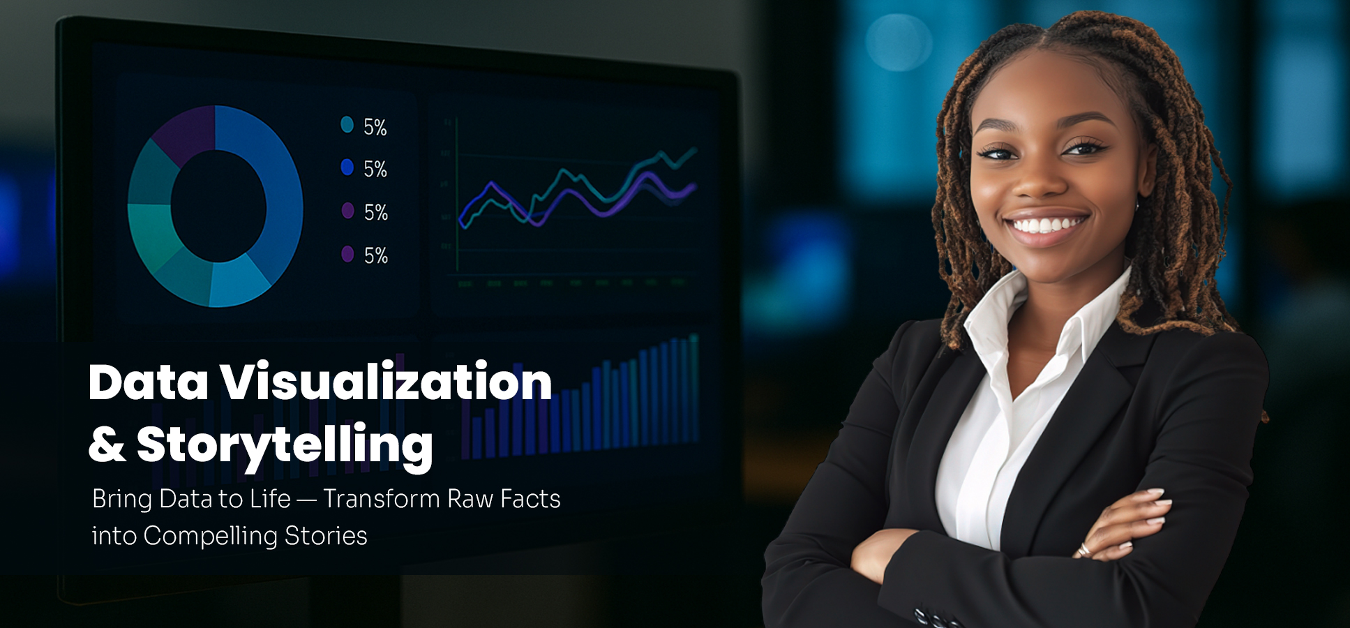
We turn complex data into clean, meaningful, and persuasive visuals tailored to your audience. From annual reports to board presentations, your data will tell a compelling story.
We develop high-impact dashboards that go beyond KPIs—integrating narrative layers, annotation, and guided insights to help leaders take action quickly.
We design branded visuals, reports, and storytelling decks that communicate clearly, beautifully, and on-brand.
We coach your teams on the art of effective data storytelling, including visual best practices, color theory, chart selection, and cognitive load.
We use leading tools and platforms such as Power BI, Tableau, Looker Studio, Excel, and Python (Matplotlib, Seaborn) to build interactive dashboards, infographics, and compelling visual stories tailored to your audience.
Define the end viewer and tailor visuals to match their decision-making needs and attention span.
Focus on the key message and eliminate clutter, noise, and distractions in your data story.
Choose the best visual format (bar, line, maps, etc.) and arrange them in a logical, flowing story.
Apply color, typography, interactivity, and design polish to elevate the experience.
The success of data lies in how well it’s communicated. At BitwareByte Analytics, we make data not just seen, but understood. You’ll gain: